
COVID-19 Time-series analysis with Pandas and Python
In a casual conversation the other day, I speculated that there was a strong relationship between the number of new reported daily Covid-19 infections and the number of future deaths. Because a catchy acronym seems to be part of any investigation, I decided to call this the Reported Infection Fatality Rate. My hypotheses is that there would be a strong relationship between these two numbers, separated by some time gap as an unfortunate fraction of people with new infections eventually succumbed to the disease.
Reliable and publicly available daily Covid-19 data is available from several web-based API endpoints. This made it an easy dataset to use for the analysis. I also wanted to familiarize myself with the Python language and the Pandas data analysis package as part of this exercise.
I did the analysis in a Jupyter notebook that can be accessed here. I chose to use the data available from the Covid Tracking Project API located here. This dataset has many data fields it captures, but the two variables of interest for this simple analysis is ‘positiveIncrease’(the new positive cases recorded on each day), and ‘deathIncrease’ (the new deaths recorded each day).
The first thing needed is to import the dataset into a Pandas dataframe:
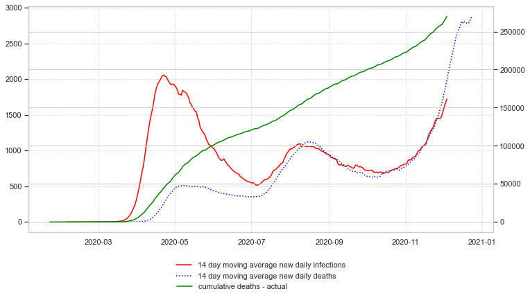
Visual examination of time-series data is always helpful, so the next step was to create a simple plot of the two data series:
Notice that a variable has been created that specifies the number of days used to calculate a rolling average of the variables in this dataset. This is needed because the raw dataset is subject to a high degree of weekly variation due to things like the workweek length and holidays. I chose to use a 14 day moving average because it smoothed out the data nicely and made the relationship between the two variables very clear. If you have a copy of the workbook, it is easy to change the variable to one and see its effect on the smoothness of the resulting graph.

Examining the plot of the two time-series variables makes clear that there is a a lot of similarity in the shape of the two curves even though they are plotted on different axis scales. In particular, after June 2020, the general shape of the series matches nicely. We can easily use the Pandas .shift() method to plot deathIncrease variable lagged in time by a certain number of days. This will display what we assume is the effect variable at the same time on the x-axis with what we assume is the causal variable, which in this case is the number of new infections. Here is the code used, followed by the resulting plot:

The blue curve is daily deaths (right axis) and the red curve is daily new infections (left) axis. If the death curve is shifted back in time, it looks like it will mirror very closely the new infection curve, at least for the most recent data. The big gap at the beginning of the dataset is most likely due to the novel nature of the coronavirus and the initial uncertainty about how best to treat it, along with the lack of testing capability, which led to underreported new infections. The next plot shifts the death curve back by the ‘lag’ value, which can be adjusted to get the best visual correlation. It turns out that 21 days is about perfect.
The next step is to find the relationship between lagged deaths and initial infections. To do this, a death prediction factor (or scalar) is created for each day by dividing the daily death by the daily infections from 21 days earlier. Once this is graphed, it is clear that the relationship has been fairly steady after the initial infections in April and May. The red line is daily data and the blue line is the 14 day moving average for this factor.

Examination of the graph shows that the predicted death factor was initially very high, but very quickly converged to a relatively stable value. A zoomed in look at the data after June 1, 2020 can be created by limiting the time period being plotted to only data after June 1:

The plot shows both the smoothed (blue) and unsmoothed (red) death factor. The smoothed plot seems very stable since July 1, so an average predictive death factor can be calculated. I decided arbitrarily to use the last 45 days of data for the calculation of this average, reasoning that it would most accurately reflect the current state of the art treatment course for infected patients in the hospital system:
This death factor can then be used to predict future deaths based on initial infections. The Pandas dataframe is used to create a new column of data with the 21-day in the future forward predictions based on that day’s initial daily infections:

Next, the predictions can be extended into the future by adding additional date rows to the dataframe, calculating the predicted deaths, and then plotting them:

It is easy to see from this that with the currently rising reported daily infections, the future deaths over the next three weeks are sadly predictable. As a check on its statistical significance, the python sklearn package can be used to calculate an R-squared value for this relationship:
At the time of this writing, the R-squared value is 0.92, which is very high.
Next, the cumulative deaths can be calculated and plotted:
Finally, an estimation of cumulative deaths three weeks into the future can be made and plotted:
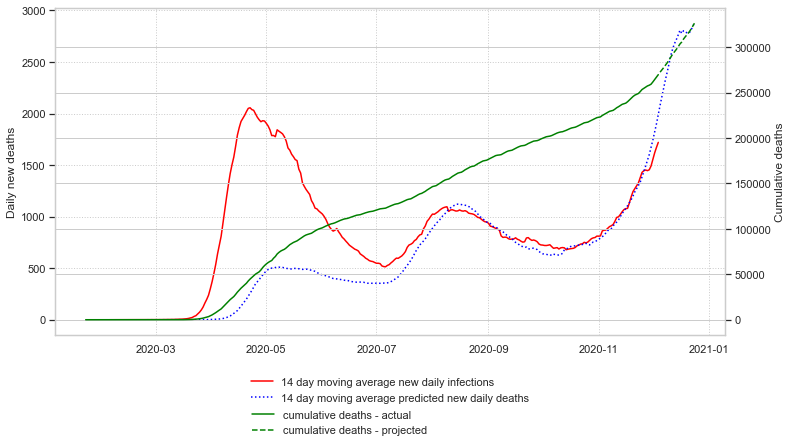
At the time I finished this article, the predicted US cumulative deaths on December 26, 2020 is 331,840.
I was surprised how grimly predictable future deaths are once a new daily infection number is known. It illustrates how inexorably this virus picks off about 1.7% of the people who get it and are tested for it. The scary thing about such a simple model is that it does not take into account current hospital capacity limits, and it is quite possible this death factor could rise if critically infected people are not able to be treated because of the lack of room in our hospitals. Take all the precautions possible, because the US is in for a very grim winter.